Table of Contents:
- Template Designer Introduction
- Template Designer Features
- Template Properties
- Template Editor Elements
- Template Designer Basic Instructions
- Template Editor Element Properties
- Template Editor Layout
- Template Editor Group Properties
- Element Properties Alignment
- Template Management and Preview
- Lock and Unlock Design Templates
Template Designer Introduction
User Rights
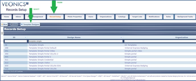
If you have rights to see, edit and create new badge templates, you will see the Record Setup tab, and once selected, the Template Designer icon is displayed. The Template Designer is used to manage design templates; however, first, make sure the Organization and Record Setup have been created.
Locate
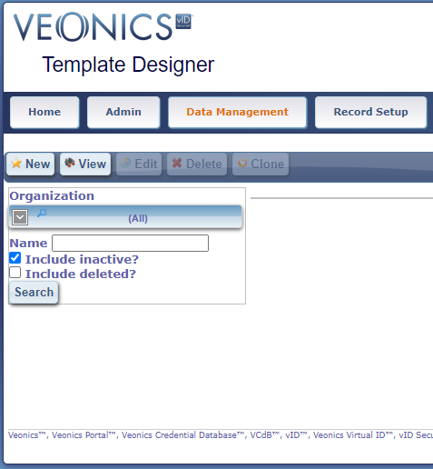
From the Record Setup tab, select the Template Designer found in the secondary icon bar, next to New/View. Once selected, the Template Designer search tool is displayed.
Security Caution
Template access must be first assigned within user rights, and is established at the organizational level. Be careful when assigning Organizations to a Template if it should only be accessed/used by various Record Manager "Card Groups" and those who have access. If not assigned correctly, they can be seen by all within an Organization's hierarchy, which could be a security concern.
Template Designer Features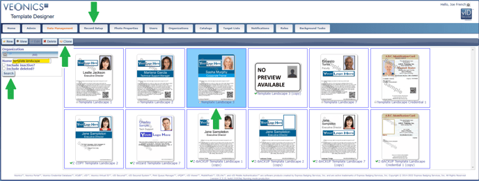
New, View, Edit, Delete, or Clone
-
The New icon allows authorized users to create new templates
-
The View icon allows authorized users to see the design and related elements. They can not edit or save any work. This is where users Unlock Approved Template Designs.
-
The Edit icon allows authorized users to edit all aspects of a Template Design. Only trained users should be assigned this right, as resulting errors can not be reverted unless backups have been Cloned, or Exported and saved in a server location that can be found by the user when needed at a later date.
-
The Delete icon allows authorized users to delete a selected template. However, the templates are not actually deleted and can be recovered by authorized users.
-
The Clone icon allows authorized users to clone or copy a selected template.
Getting Started
Either locate or create a new template.
- Type the Name to be searched and press the Search icon
- Select both "inactive" and "deleted" templates if searching all templates
- Select the Template name using the left mouse click to highlight
- Either select the View, Edit, Delete, or Clone icon as described above
- If a Template is locked, it can not be Edited, unless user rights permit, and is unlocked using the View icon and then selecting the Unlock icon
- If no template is found, or a new template is needed, select New to create a new one
Template Designer Navigation
Now you are in a specific template design and where all the work will be done. Here is a review of all primary icons; Save, Export, Import, and Go-Back; and sub-tabs; Properties, Front, Back, and Preview.
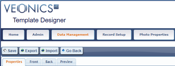
Primary Icons
Save - Use this icon frequently when editing templates. No work is saved unless it is selected!
- The Save icon is not displayed when in View mode
- Using the Save features in the Front/Back Properties section does not save the Template; use the Primary Save icon, and "Design successfully saved" will be displayed in a green header bar
Export and Import - These two features are typically reserved for system administrators and provide the ability to export a template as a backup, or use it in importing when needed. A common reason to import is reverting back to the original design upon an edit and save error. For this reason, it is always a good habit to Clone approved designs and save them with a BACKUP name. Go to the Tips Section in Preview for more information.
- Exported files are in raw JSON format
- No validations are performed when importing designs (!)
- The imported design overrides the design currently being edited
- This can also be used to keep a backup of a design version and potentially roll back any changes
Go-Back - select to return to the main Template Designer page
- Always remember to Save any changes before selecting Go-Back, otherwise, all changes will be lost.
- Using the Save features in the Front/Back Properties section does not save the Template; use the Primary Save icon, and "Design successfully saved" will be displayed in a green header bar.
Secondary Tabs
Properties, Front, Back, and Preview relate to each individual Template Design.
Template Editor Properties
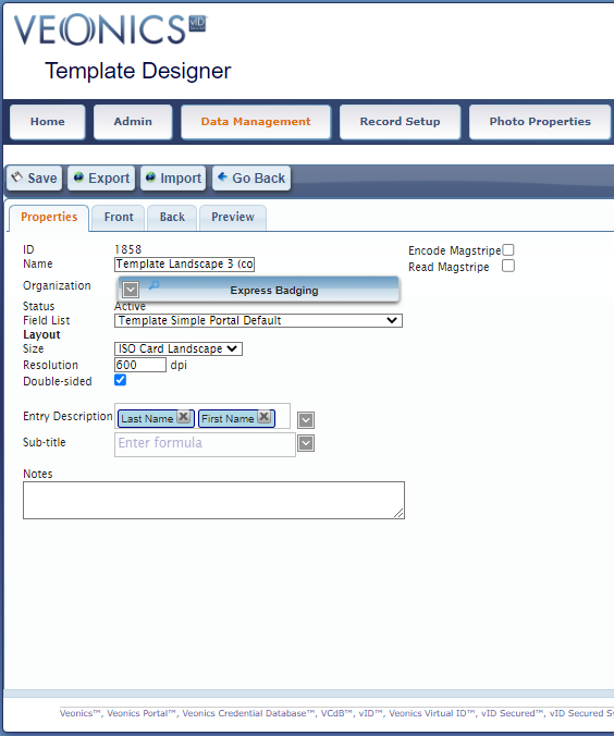
In order, here is a review of each Property and how it relates to the template.
ID - Is an automatically assigned index value for each template used internally with the code
Name – The user defines a unique logical Template name:
- ABC-Employee
- ABC-Student
- ABC-Visitor
- Once the correct Organization appears, select the radio button and then click anywhere outside the entry box to exit the assignment process
- A Template can be assigned to multiple Organizations by selecting additional radio buttons
- Active - currently in use
- Inactive - marked as inactive, may be used in the future
- Deleted - marked for deletion. never use
Layout Size – Select either
- Landscape (long edge on bottom)
- Portrait (short edge on bottom)
- Employee - Full Time = Horizontal Design
- Employee - Under Age = Vertical Design
- Most entry-level badge printers are 300 DPI, and higher-end is 600
- You must select 300 DPI when printing and encoding magnetic stripe cards
- The backside of a badge is like a billboard on a busy highway, many will see it, and if you have no message, they will not get one! CLICK HERE to read more
- Entry Description
- Last, First
- First Last
- Sub-title
- City, State
- Location Name
- There are uses planned when the Virtual ID is enabled using a future App, and again will replace the default Card ID, with these programmed values.
Encode/Read Magstripe - Reading or encoding of magnetic stripe requires the use of a printer-specific plugin called Veonics Print Queue Manager or VPQM and specialized printer-specific encoding hardware
- Compatible Printers
- All current HID/Fargo printer encoding modules
- All current IDP Smart encoding modules
- Confirm if the printer was purchased before 2019
- Encoding a magnetic stripe allows you to specify an expression based on the existing card fields to write on each track
- The expression should be compatible with the track’s encoding
- Track I: Alphanumeric
- Track II: Numeric plus :;<=>?
- Track III: non-standard, originally numeric, may contain alpha depending on encoding supported by the device
- Leading and closing “Sentinels” are added by the plugin
- The expression should be compatible with the track’s encoding
- Reading of magstripe allows specifying which field in the record will “receive” the value read from each track
- RFID read/write is currently in a future wishlist lineup of modules.
Template Editor Elements (Front & Back Tabs)
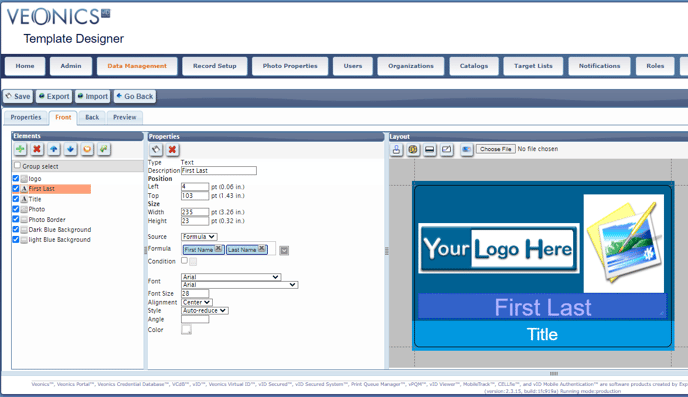
Elements
The Veonics Portal Element section is a simple toolset used to quickly create Design Templates for simple projects having only one or two designs and simple logic statements to turn on and off elements based on field logic and associated data.
However, it becomes a very powerful tool in the hands of a trained user when badge designs become complicated, requiring Design Groups that are used to print many variations of badge designs from the same Field List and Template, where element location and sizes vary per embedded Design Group.
Element Icons
- Add Element Icon
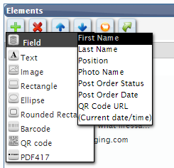
- Field
- Allows the addition of fields from the selected Field List in the Template's Root Properties tab
- The Field Properties are published to the right
- Text
- Allows the addition of static text to be placed with a template
- "Employee Num: " = Text Value
- "1200001" = Field Value
- Resulting in Employee Num: 1200001 printed on the badge
- Allows the addition of static text to be placed with a template
- Field
-
- Image
- Allows the import of images for static printing when Properties Source = Fixed
- Allows location and size of merged photos when Properties Source = Field
- Rectangle
- Insert squares, rectangles, and color bars with 90-degree corners
- The border dimensions, location, color, fill color, thickness, and print logic are assigned in the Properties
- Ellipse
- Insert circles and ovals
- The border dimensions, location, color, fill color, thickness, and print logic are assigned in the Properties
- Image
-
- Rounded Rectangle
- Insert squares, rectangles, and color bars with rounded corners; the radius is defined by the user
- The border dimensions, location, color, fill color, thickness, and print logic are assigned in the Properties
- Rounded Rectangle
-
- Barcode
- Code 128
- Code 25
- Code 39
- Codabar
- QR Code
- Insert the Virtual ID barcode
- Publish static data or variable data from Field List
- Create quick URL links
- Barcode
-
- PDF417
-
-
- Publish static data or variable data from Field List
- Create quick URL links
-
- Delete Element Icon
- Once a single Element is highlighted, you can Delete it
- Multiple Elements can not be deleted, only one at a time
- Blue Up and Down Arrows
- Once a single Element is highlighted, it can be moved up or down within the list
- Reduce the browser viewing percentage to display all Elements in longer lists onto one viewable screen.
- Duplicate Element
- Once a single Element is highlighted, it can be duplicated and reformated, saving Element rebuild time
- Send to Back
- Ideally used when Duplicating an Element so that it can be moved to the back
- The first name and last name first initial are printed on the front
- Duplicate the Formula field and, move it to the back, format Last Name to print in full.
- If not sure what to print on the back side of the badge, duplicate the front and move the copies to the back, so once worn on a lanyard to flip around from front to back, there is no difference in others' viewing pleasure.
- Ideally used when Duplicating an Element so that it can be moved to the back
Basic Template Designer Instructions
It is best to Clone an existing Template, and then edit the Properties and Elements as needed. When creating a Template from Scratch, here are the basic steps:
- Select New and complete the Properties tab
- The name should be descriptive so its logical to others
- Assign to the correct Organization and Field List
- Select Size - Landscape or Portrait
- Know your printer's DPI (dots per inch) Spec and enter here (300 or 600)
- Enable double-side or duplex printing by selecting the box
- Enter Last, First to aid in printing queue and Virtual ID management
- Notes help tell other authorized users any unique operations of this design
- Enable Encode Magstripe and Read Magstripe as needed (advanced feature)
- Select the Front tab and start the Template build
- By default, a background placeholder starts the build
- If you have a background template, select the Source as Fixed, Lock the Aspect Ration, and then Choose to navigate and Open/Import the image
- A background template is a static design that prints on all badges
- If not needed, delete it
- If you have a background template, select the Source as Fixed, Lock the Aspect Ration, and then Choose to navigate and Open/Import the image
- Select the Green Plus (Add) Element icon, and select Image
- Enter a Description like; Logo and select the Properties Save Icon
- Select the Lock Aspect Ratio next to the Properties' Size
- Select Fixed next to Source
- Select Choose, navigate to your logo (jpg or png), Open your logo and edit the Size, Width, and Height as needed
- Move to the desired location via mouse or using the Position's Left and Top attributes
- Select the Primary text "Save" icon above Properties to save your edits, and do this regularly.
- Using the Properties logo Save icon only helps update the Element Description but DOES NOT save the Template!
- Condition and Group logic is advanced, GoTo Group Properties section to learn how.
- Angle defaults to 0, and where image rotation is managed
- Opacity will lighten the image when used as a background or watermark
- Filter, Color Processing, and Alpha Masks are advanced features
- Select Add Border, when needed, and it appears behind the imported image, and then select the attributes needed to meet design requirements regarding; internal border Color, Border Width, and Border Color
- Remember to select both when moving and when using Conditional logic
- By default, a background placeholder starts the build
- Select the Element Add icon, and insert another Image to be formatted for the Photo
- Follow the same instructions above with the following changes
- Description is Photo
- Width = 72 px or 1" wide
- Height = 90 px or 1.25' wide
- Source = Field
- Field = Photo
- Move to the desired location
- This is an ideal place to Add Border for color coding, making the border wide enough to be seen from four to five feet away.
- Now it is time to Add some Merge Text by adding the Field Elements
- Select the Element Add icon and choose Field, and mouse over the field to add
- As with adding the Image above, complete the Element Properties as needed
- In the Source, assign the associate Field or Field Formula
- Start with the First Name
- Repeat Steps for the Last Name on a second line
- Use Formula to place First Last on the same line
- NEVER place First and Last names on the same line on portrait badges, no one can read them!
- Learn more about field SOURCE here
- Use Formula to place First Last on the same line
- Repeat Steps for the Title, Department, and other fields
- New to Field and Text are Font attributes that must be complete
- Learn more about FONTS here
- Design the backside by selecting the Back tab, and the same rules apply in the Elements and Properties.
Here are some backside tips:- Most duplex badge printers print solid black on the back when using CMYKK ribbons, and duplex color when using CMYK ribbons and color enabled for both sides
- Use the Toggle On/Off Magnet Stripe and Slot Punch placeholders
- Duplicate Elements on the front side and Move to the back
- When adding paragraph text
- Set Style to Wrap
- Set Max. Lines count matching line returns
- Set Line Height to 1 or higher
- There is no bullet feature, so create text columns to place bullet text to the left, then clone the text list of bullets, move to the right using the Position-left values, then edit with related content, adjusting/removing bullets as needed
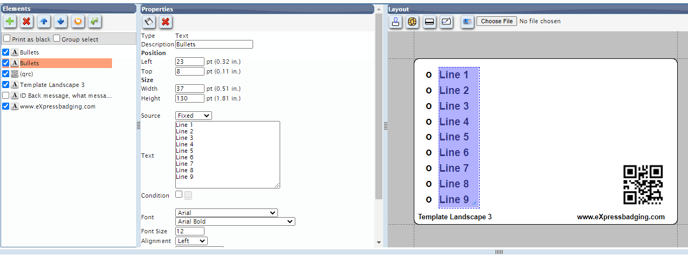
- Backside Considerations
- Mission and Vision Statement
- Fire/Safety Guidelines
- Intercom Codes
- Customer Service Tips
- Important Contact Information
- ID Badge Rules and Regulation
- If Found, Please Return to:…
- Emergency Evacuation Procedures/Map
- In Case of a Natural Disaster….
Template Editor Properties (Front & Back Tabs)
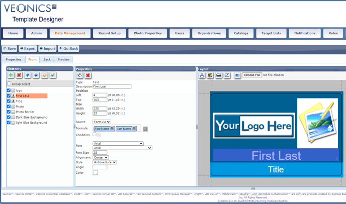
- Type Description - The Element value that appears for design purposes only and does not print. This will be the name that is shown in the Elements pane.
- If building Design Groups, start with a common initial so it associates with the Group
- Emp-First
- Empl-Last
- Emp-Photo
- Emp-ETC.....
- Stu-First
- Stu-Last
- Stu-Photo
- Stu-ETC.....
- If building Design Groups, start with a common initial so it associates with the Group
- Position Top and Left - The defined location values of the element, which can be negative. These values indicate where the item will appear on the badge. The top left corner is (0,0).
- You can type-edit these values to position elements precisely, select the element with a left mouse click, use the directional arrows within the Position element value once the cursor enters the field, or manually place it with a mouse.
- Size: Width and Height - Defines the display and print dimensions of an Element.
- It is important that Text Elements are defined correctly; otherwise, they may print incorrectly.
- Never place Text Elements, so they go to the far edges of a badge and start (Left) and end (Width) so there is a .10" or 1/8" border to prevent run-off truncation
- Size can affect the font size and length of printed text when "Auto-reduce" is selected in Text Properties, so double-check the height and Width as the "print area" to ensure it prints correctly
- It is important that Text Elements are defined correctly; otherwise, they may print incorrectly.
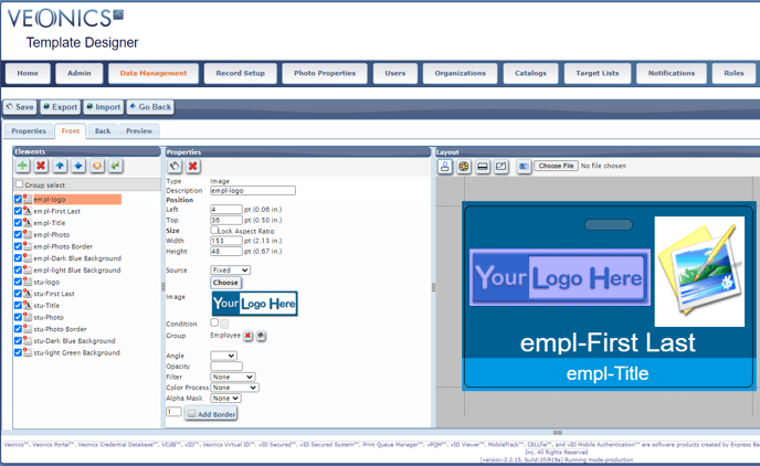
- Lock Aspect Ratio - (Image Only Use) Uses the file dimensions height and width upon import
- When an Image Element is added, it is recommended that you enable the Lock Aspect Ratio next to the Size
- This will import the image, maintaining the true aspects of height and width.
- Otherwise, manually changing the height and width almost guarantees losing the true aspect ratio; meaning the image or photo will be distorted when printed.
- Source
- Fixed - Set Elements as Fixed when they do not change and print on all badges
- The word Employee Num is printed as a header over the Employee Number 1200001
- EMPLOYEE NUMBER (Fixed/Static)
- 1200001 (Variable)
- Fixed Elements can be assigned in Groups or have individual Conditions that activate or deactivate them based on Conditional logic and print accordingly.
- The word Employee Num is printed as a header over the Employee Number 1200001
- Fixed - Set Elements as Fixed when they do not change and print on all badges
-
- Field - Allows the Field List to be selected, adding a merge field to be printed
- Format - (Field Related only) Each field in the expression may have certain formatting options
- Padding | Length | Character - primarily used to left pad numbers with leading zeros
- Padding - truncating to a certain length
- Default - is Left Padding
- Left - Element position is to the Left of the padding
- 12345 element value
- 3232000 padding
- 123453232000 final barcode/encoded number
- Right - Element position is to the Right of the padding
- 12345 element value
- 11111 padding
- 1111112345 final barcode/encoded number
- Current padding does not work with Zeros value
- Length - quantity of Character repetition
- Characters - Default alpha/numeric entries
- Zeros can not be used as padding currently.
- Design logic must be used with layered elements
- 000000000(nine zeros static value )9(single digit ID Number)
- Logic
- if ID number is less than 10
- Logic
- 00000000(eight zeros static value )99(double digit ID Number)
- Logic
- if ID number is less than 100
- AND
- if ID number is greater than 9
- 0000000(seven zeros static value )999(double digit ID Number)
- Logic
- if ID number is less than 1000
- AND
- if ID number is greater than 99
- ETC
- 000000000(nine zeros static value )9(single digit ID Number)
- Padding - truncating to a certain length
- Padding | Length | Character - primarily used to left pad numbers with leading zeros
-
-
- Case change
- Default - Prints as entered/imported
- Uppercase - All characters print UPPERCASE
- Michael = MICHAEL
- McDonald = MCDONALD
- Case change
-
-
-
-
- Initial - Prints first character
- Empty | Not Empty
- Primary use is barcode/mag stripe encoding, do not use with text
- Empty - Check if Not Empty text overwrites field value
- Not Empty - Enter Text to replace empty fields value
- Catalog "Use Description" check box - THIS FEATURE IS INACTIVE
- When selected the Catalog Description will print, and not the Catalog Value, if/when different
- Dates
- Empty | Not Empty
- Empty checked - THIS FEATURE IS NOT DEFINE
- Not Empty Provided - THIS FEATURE IS NOT DEFINE
- Date Format -
- Custom
- ISO Date
- US Date
- Int'l Date
- Jan-16
- ISO Date/Time
- Empty | Not Empty
-
- Formula - Is a powerful tool combining Fixed and Fields into one Element
- First Last, RN
- Logic: If "Professional Credential" is not empty, print: First Last, RN
- Logic: If "Professional Credential" is empty, print: First Last
- Logic: If "Professional Credential" is not empty, and Patient Facing = Yes, print: First L, RN
- First Last, RN
-
-
-
- EMPLOYEE NUM: (Fixed) 1200001 (Variable Field)
- EMPLOYEE NUM: 1200001, printed on the back of the badge
- 0000(fixed)12345(Employee Num -variable)3232000(Fixed)
- 0000123453232000 as a joined barcode number (Kronos Format)
- EMPLOYEE NUM: (Fixed) 1200001 (Variable Field)
-
- Condition - The Condition feature, also known as Design Logic, is another powerful tool designed to print elements based on meeting specified conditions that use if/then/do/do not statements.
It is very important that all data used matches exactly as stated in the Condition. Abbreviations, hyphens, dates, and case-sensitive fields can cause issues when a badge does not display correctly. Make sure that all fields and their data have been carefully reviewed for consistency and accuracy. This feature requires knowledge of Boolean logic statements and can become quite complex for badge designs with many options that render differently based on the data within a single badge record.
- In the Properties section, regarding the new Employee group, check the box, then select the Condition three ellipses and build the Condition, for example.
-
- Field = Badge Type
- Condition = Equals
- Value = Employee
- Use the exact case and spelling in the Badge Type Field or the assigned Catalog.
- If the text case is inconsistent, select the "Ignore Case" option if available.
- Or use the Contains Operator.
-
- In the Properties section, regarding the new Employee group, check the box, then select the Condition three ellipses and build the Condition, for example.
-
- When an element has a condition attached, it will only render if that condition is true.
- Typical use: design variations based on the card record’s data
- Multiple conditions may be specified for an element
- All of those conditions must be met (AND)
- More advanced users can create more complex expressions using other Boolean operators (OR, NOT) in an expression tree.
- Pseudo-fields available
- QR Code URL
- Current date/time: useful to check the expiration date
- In addition, conditions on date fields support special operators “after/before now”, with an optional offset. For instance, “if the expiration date is before 10 days after now”
- Is vID: true if this vID is being rendered virtually, rather than for vPQM
- Privacy: maximum field visibility level available to this user
- Watermark: not meant for conditions, but to customize the location and style of the status watermark so as to not interfere with barcodes and other elements
- Group Properties can be used to group elements that are controlled by a single set of Conditions. see the Group Properties section for more.
- When an element has a condition attached, it will only render if that condition is true.
- Fonts - the Template Designer has a set of fonts to use. If you have specific fonts and have the right to use them, they can be uploaded for use in your account only.
- Fonts - Select the font and style
- Font Size - Select or Type the correct size
- Alignment - Select Left, Center, and Right
- Style - Select
- Normal - Based on size and element height and width will determine if the text will fit or truncate
- Auto-reduce - If the text will not print within the element-defined width and height, the system steps down to a font size that will fit. So, if you have First Last on the same line and on a Portrait design, the name may only be readable using a magnifying glass, so it is suggested to place First and Last on two separate lines when using portrait formats.
- Wrap - used when needing elements to print in full, even it a return is needed. This is ideal for back statement paragraphs
- Max. Line - Enter the number of lines to be wrapped
- Line Height - Start with 1 and go from there regarding line spacing
- Angle - the one tool to take advantage of when needing to print both landscape and portrait badges in the same Design Template
- Also great when taking some design freedom to print Badge Types along left or right sides vertically/sideways
- Another option, make the Element a Wrap and set the width for one character, center justify, and print vertically in a stacked format.
- Color - Select the Element Color
- Select the font color
- For Rectangles and Ellipses, there is a Border Width and Border Color to further get creative.
- In the Layout section, select the Choose File icon to upload a color that you'd like to match, then select the color selector box, and the image is displayed to "pick" the color with the dropper. It is a good idea to copy the color value so you can paste in other areas to ensure the color is 100% matching.
- Image Properties - These features are used for advanced image processing
- Opacity - reduce 100% view by a set percentage that lightens the image as it lowers
- Filter
- Grayscale - converts images into shades of gray
- Sepia - coverts image into an old photo-like look
- Currently, the sample effect for sepia is in an oval with faded edges
- Line Art: high-contrast black/white version of the image
- Color Process and Alpha Mask - Used together to create other effects on the image
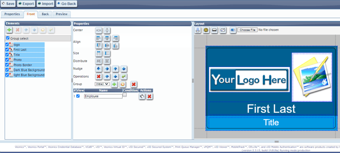
Group Properties
Design Group Building
Element grouping is an advanced tool, but is worth understanding upfront, as it could save time and resources. Design Properties "Group" is the panel for group logic and positioning. In this window, the user can move groups of items together within the Elements list and the badge design. They are displayed in the badge design Layout window how they will be published/printed, but you must de-select the other elements to clearly see a particular Groups layout. The Final option is group logic for designs that require different fields or elements depending on the information in the record.
When looking for group logic in the temple designer, you must select the Group check box and one element, or at least 2 elements without selecting. When the elements are selected, you can see the different group options in the middle screen. By selecting the three dots next to the name, you can see the conditional logic which is assigned to the card templates.
Before starting to create individual Elements, start by deciding the Property's Description Names before starting the build. If the design is simple, then; First, Last, Title, Department, Photo, Photo Border, Color Bar, and Logo are good enough names, and no groups are needed
However, if you are designing several groups (employee, contractor, visitor, temporary, faculty, staff, student, patient-facing, certifications...) then the Group feature of Elements will be a very useful tool.
First Design Group Tips:
- Build the first Design Group (Employee) and Save as you go
- Print and dial in the design, (Front and Back) until it is approved
- Select the Group Select icon, then individually select all Elements
- Select the plus sign next to Groups in the Properties tab
- Name the Group 'Employee" and then Save it in the upper left of the Designer
- All Elements will have a small 1 in the upper left of the icon.
- When building Groups, it is recommended to enlarge the Browser view to 150% to see them better
- It is also recommended to rename the Description to associate the element with the Employee Group name, making it easier to read over time as the list grows
- Empl-First
- Empl-Last
- Empl-Photo
- Continue for all Elements added
- In the Properties section, regarding the new Employee group, select the Condition three ellipses and build the Condition, for example;
-
- Field = Badge Type
- Condition = Equals
- Value = Employee
- Use the exact case and spelling in the Badge Type Field or assigned Catalog
- If the text case is not consistent then select the "Ignore Case" if available
- Or use the Contains Operator
- Once you select the OK icon, you must SAVE the condition as the very next step using the Group Actions Save icon in the Properties section. Failing to do so will result in rebuilding the condition until saved correctly
- At this point, it is recommended to complete the back design (see below), and then use the Preview tab (see below) to test the logic
- Once successful in the Preview tab and saving all work, it is recommended build or edit the Data Management Record Properties screen, assign the Design Template, and then create a test record to view the Virtual ID for final proofing
- Upon viewing the Virtual ID, and possibly even printing one sample, you are ready to start building additional Card Groups within the same Design Template
Additional Design Group Builds
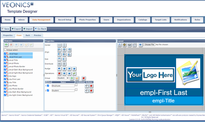
- Enable Group select again
- Select all elements from the existing Design Group that will be in the Second Group
- Most likely, all elements
- Select the "Clone into group" icon (golden circle) in the Properties Group line
- Build the Badge Type Condition using "Student", and save it under the Actions tab. Save save save before moving on, or you're rebuilding it again!
- Now a 2 is placed next to each Element, and time to rename it
- Stu-First
- Stu-Last
- Stu-Photo
- Continue for all cloned elements...
- Now that the Elements are cloned, place them in a logical order by moving the first cloned Element to the end by selecting it, then using the Element down arrow, selecting until it is at the bottom, and repeating for the second, third, etc..
- If the bottom color bar is a different color for Student, then select it and edit the color
- It will print the new color when Student is selected from the Badge Type List
- If the last name gets changed to the Last Initial, left-click on the last name in the Formula field, change the length to 1 and select the green check mark to save and exit
- You can now move elements in the second group where they need to print.
- Group display is made easier by turning off the other Groups Elements by de-selecting the left box.
- Warning, when Saving and Exiting the Template, it defaults upon re-opening to an all Elements view requiring deselecting again, to view a single group
- Create a test record for the Student design, publish the Virtual ID, and you can then dial it in real-time, and print it for final approval
- Repeat for additional designs.
- This process is difficult and challenging, however once completed, only one Record Property is required to print all designs without having separate Record Properties for each Design Template.
Element Properties Alignment
Select two or more Elements and select:
- Center - to center landscape or portrait of the first selected root element
- Align - to all to the left, center, right, top, middle, or bottom of the first selected root element
- Size - to match the width or height of the first selected root element
- Distribute - to them equally horizontally/landscape or vertically/portraite of the first selected root element
- Nudge - to move all selected elements up, down, left, or right
- Operations - Delete, bring forward, send backward, or send to back selected elements
- Group - See Groups above
Template Editor Layout
- Toggle On/Off Notch (Slot) Mask
- Toggle On/Off Smart Contact Chip
- Toggle On/Off Magnetic Stripe Position
- Toggle On/Off Signature
- NEVER USE A SIGNATURE FOR VERIFICATION; USE THE PHOTO!
- Display Background Uploaded Image
- Choose File to add a background image to match the design to
Badge Template Design Viewer
Here is where all the work in Elements and Properties results in a Design Template for viewing. It is not 100% WYSIWYG (what you see is what you get), but is very close at times.
Tips:
- Even though moving and sizing Elements with the mouse is fast, using and editing the Properties values can help get better matching results.
- It is best to upload images that are saved as transparent
Template Management and Preview
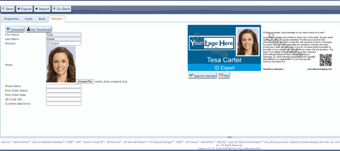
The Template Design Preview tab lets the user preview the template with sample data and uploaded sample photo. The resulting Template is assigned within the Record Properties during setup, and the Template Preview image depicts the assigned template. If the Template has various designs based on logic, use the most relevant one for the Template Image. Also, once the template is approved for printing, the design can be locked by selecting the Approved Design icon.
Field List and Generate
All of the fields in the Field List are displayed and are empty by default. The same with the photo if applicable. Once sample data is entered, a photo is uploaded (Choose File) with the same height and width attributes as the template photo element.
Proof Management and Set Thumbnail
A sample badge can be Previewed by selecting the Generate icon. If the design looks 100% correct, select the Set Thumbnail icon and the Save Icon to set the thumbnail as the assigned Card Group(s) system preview default. The design can be locked by selecting the Approve Design Icon under the Sample Preview image.
The Template Cloning feature is ideal for managing Proof Sign-Offs for signature/approval and future template edits. This process creates an archival breadcrumb of legacy Template builds.- Once changes are needed to the original live template, Clone and Save it as EMPLOYEEv2
- Edit EMPLOYEEv2 and go through the proofing process until signed/approved
- Rename the old live EMPLOYEEv1 template to EMPLOYEEv1OLD, delete the backup EMPLOYEEv1BACKUP, and Clone the approved EMPLOYEEv2 as EMPLOYEEv2BACKUP.
- From Data Management, search, type name in the white box under Group Name if needed, and then select the related Group Name via left mouse click, and select Record Properties.
- Select Reopen, then Edit, then in the vID field, replace EMPLOYEEv1 with EMPLOYEEv2
- Select Save, then Activate, and testing the template by reviewing live records is recommended. Or test records that represent each design if you created them.
Tips
- Template Backups: Use the Cloning feature to save a Template copy as a BACKUPV1 once a design is approved.
- If the live design is Edited/Saved/Approved, create a BACKUPv2, keeping BACKUPv1 for archive purposes.
- For the First, Last, Title, Department, and other fields, enter short and very long entries testing font size, truncation, or cut-off to see how the auto-reduce feature works.
- If the template uses design logic, enter the correct data to confirm that the design correctly renders. If the logic is complicated, you may use the Virtual ID feature by creating sample records depicting each design (employee, student, patient-facing...)
- Do not upload a sample photo image unless it looks like a correctly cropped photo and to the same attributes; otherwise, it will be distorted.
- To make changes to the Template once approved or locked (lock icon displayed on search Preview image), a privileged user must “unlock” it in the View mode, and the design approval is removed until Approved again.
How Do I Lock and Unlock Photo ID Badge Design Templates in the Veonics Portal?
Upon creating and approving a Portal design template, the template file can be Locked to prevent future edits. When edits are required, the Template can be unlocked by authorized Users.
Follow the steps below to Lock your badge design template:
1. Click "Record Set up"
2. Click "Template Designer"
3. Search for the template Name, and check "include inactive"
4. Select the badge design on the right
*the green check mark means that the template is in active status.
5. Select "Edit" & click on "Preview".
6. Select "Approve design" to lock the badge design template.
*The screen resets to the template search page where you can search for the template again and you will see a grey "Lock" on the design instead of the green check mark.
Follow the steps below for Unlocking your badge design template:
1. Steps 1-4 are the same
2. Select "View"
3. Select "Unlock"
* The screen resets to the template search page where you can search for the template again and you will see the green check mark meaning that the template is in active status.